Today we're going to focus on basic univariate and bivariate analysis with R. R is an open-source statistical package, which means its free and openly distributed. This is a pretty big deal in a world in which the most major players (SPSS, STATA, SAS) are proprietary and can cost in the thousands.
R is still a programming language, though, and everyone has different levels of familiarity with code. I want you to pair up and work with a partner. Although you don't have to turn in anything for this lab, you should still try to do everything on your own computer, even if you're paired up.
We're going to use RStudio, a free GUI for R which makes jumping into it a little more easy. The first thing you need to do is to open RStudio from the Start menu. It should look a little like this (although different since I'm showing the Mac version).
Before digging into working with actual data, we're going to work with some randomly generated data to illustrate some properties of normally distributed variables. Remember, a normally distributed variable follows the normal distribution.
R has a number of easy functions that we can use to generate normally distributed data. A function is a set of prewritten code that has a name which we can use to invoke that code. The function that we want to use to generate data is rnorm (in the rest of this lab, I will write code in this font or in larger code blocks). rnorm takes up to three arguments, which are values which tell the function to do something else. The first argument is the number of values which it will generate, the second is the mean around which the variable will be distributed, and the third is the standard deviation that the variable will have. So if I write rnorm(10, 10, 100) in R, it will give me a random set of 10 normally distributed values with mean at 10 and standard deviation of 100. Try this by typing it in the box labeled "Console."
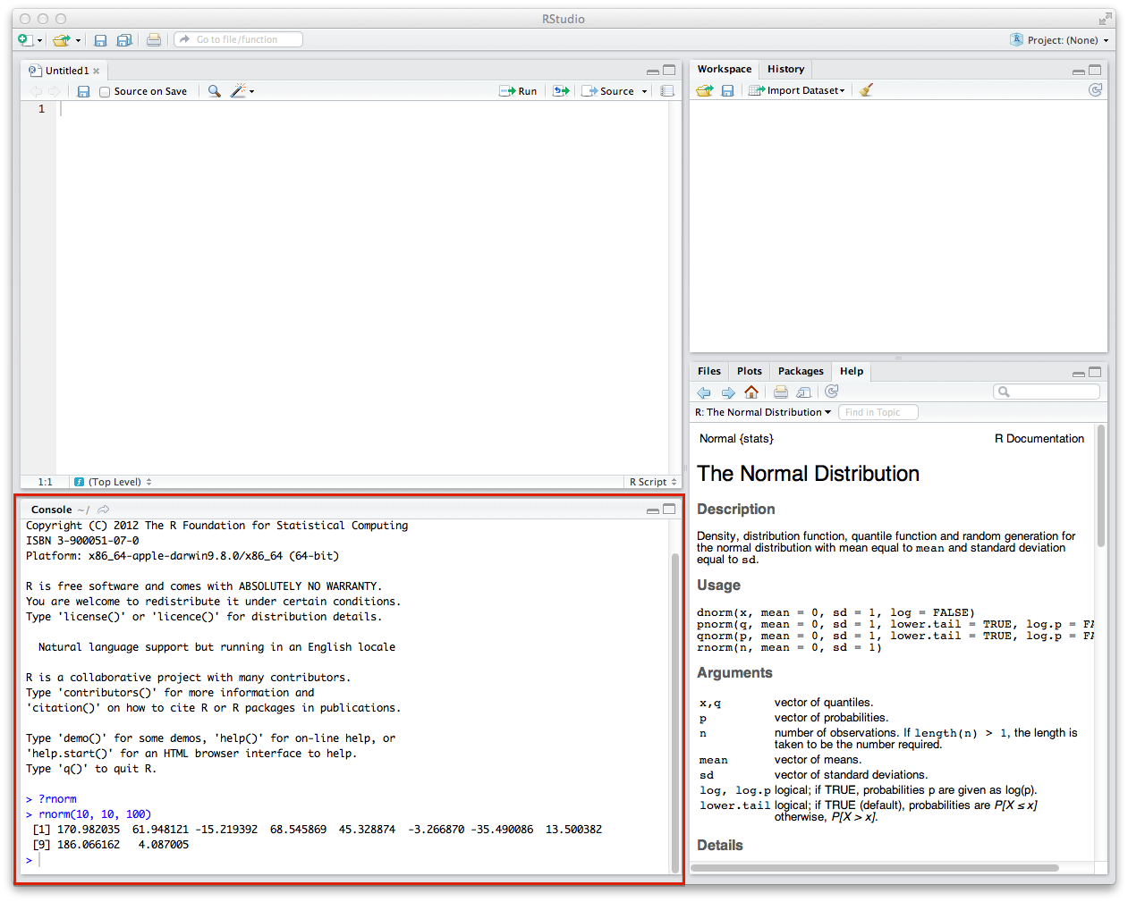
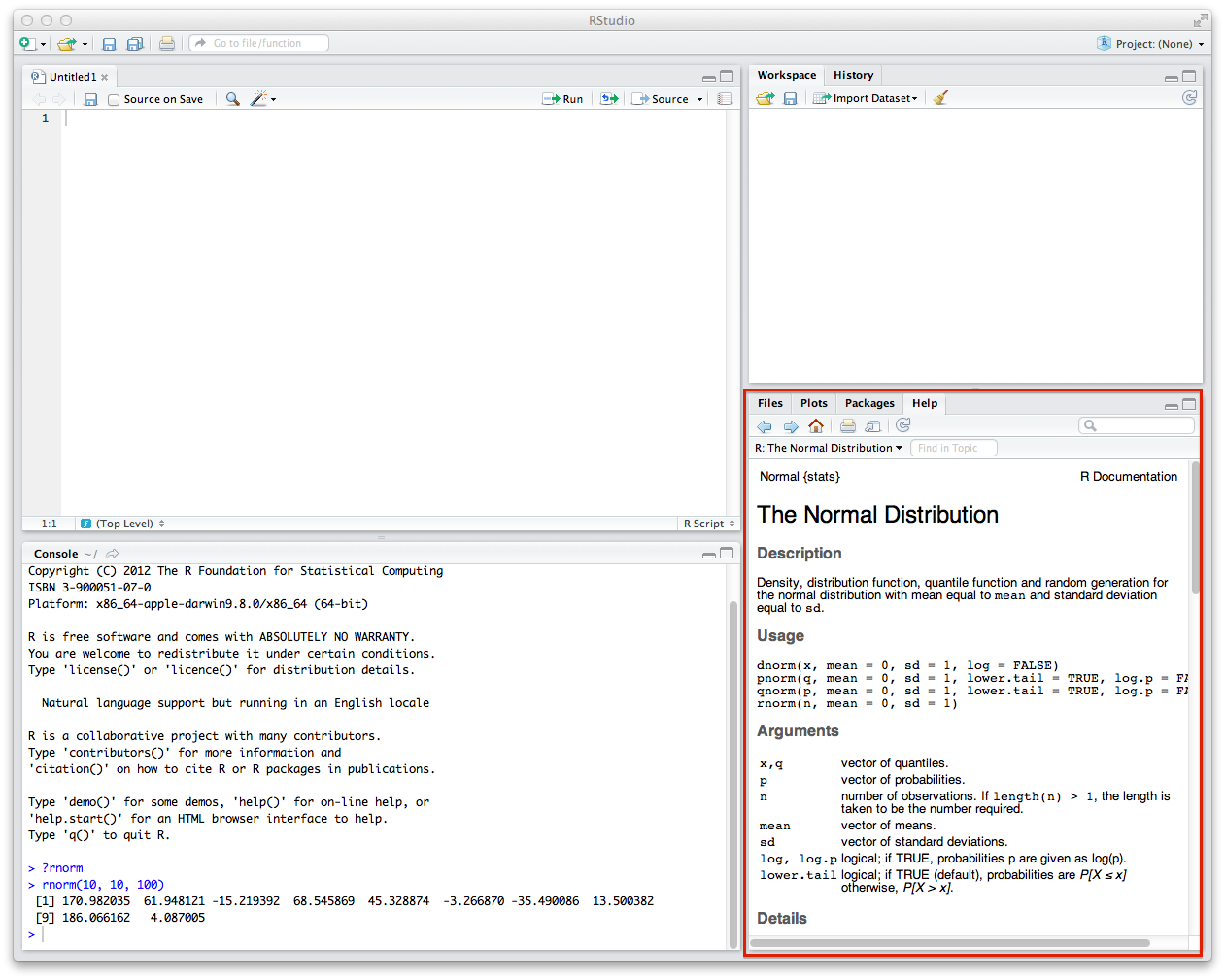
You can also get some more nitty gritty details of how the rnorm function works if you type ?rnorm in the Console. The information will pop up in the window to the right of the Console. You can see that the rnorm function is part of a class of functions that have to do with the normal distribution. You can also see that it says rnorm(n, mean = 0, sd = 1), which means the default mean will be 0 and the default standard distribution will be 1.
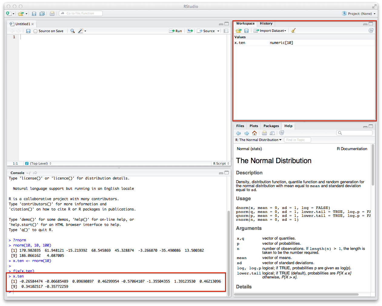
Now that we're a little familiar with generating random data, we should try to store it someplace and run some univariate analyses on it. The <- operator is the assignment operator in R. It means "put this variable in this place."
Let's try to generate some data -- 10 values with mean = 0 and sd = 1. Enter the following into the Console.
x.ten <- rnorm(10)
You'll see when you do this, the values will pop up in the Workspace tab. You can also see what these variables are by typing x.ten into the Console.
Compare the numbers you get with your partner. They will get different values from you. This is because you're doing a random pull from the normal distribution. All your subsequent summary statistics (mean, etc) will be different too.
Now that we have a variable, we can generate some basic statistics about it. We're doing to use the mean function to generate the mean, median to generate the median, sd to generate the standard deviation, and range to generate the range. You invoke these functions by giving the variable you want to access as the only argument.
mean(x.ten)
median(x.ten)
sd(x.ten)
range(x.ten)
What do you notice? Isn't the mean supposed to be 0 and the standard deviation to 1?
The last thing you'll want to do is draw a histogram of your data. This is pretty easy -- you'll just use the hist function in the same way. This will draw the histogram of your data in the window to the right of the Console.
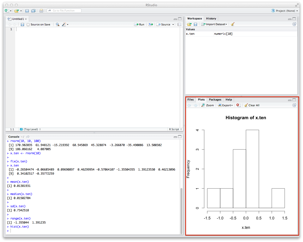
Does this look like the normal curve? How? How does it not?
Now, repeat all of these steps with a hundred, a thousand, and ten thousand values. Run all the summary statistics and generate histograms. What happens to the mean and standard deviation? What happens to the histogram? Compare your result with your partner's.
Here is some code to get you started:
x.hundred <- rnorm(100)
x.thousand <- rnorm(1000)
x.10thousand <- rnorm(10000)
Now that we've played with one variable, let's define another variable and do some basic bivariate analysis. We're going to generate a new variable called y which has some vague linear relationship to x.10thousand.
y <- 2 + x.10thousand*3 + rnorm(10000, 0, 3)
Mathematically, this is taking our original variable, multiplying it by 3, and adding 2 + another randomly distributed variable with a larger standard deviation.
First thing is first -- run the summary statistics and plot the histogram. What do you notice about the mean and standard deviation? How about the histogram? Is this a normally distributed variable?
Next, we're going to generate the scatter plot of the two variables.
plot(x.10thousand, y)
You should get something that looks like this.
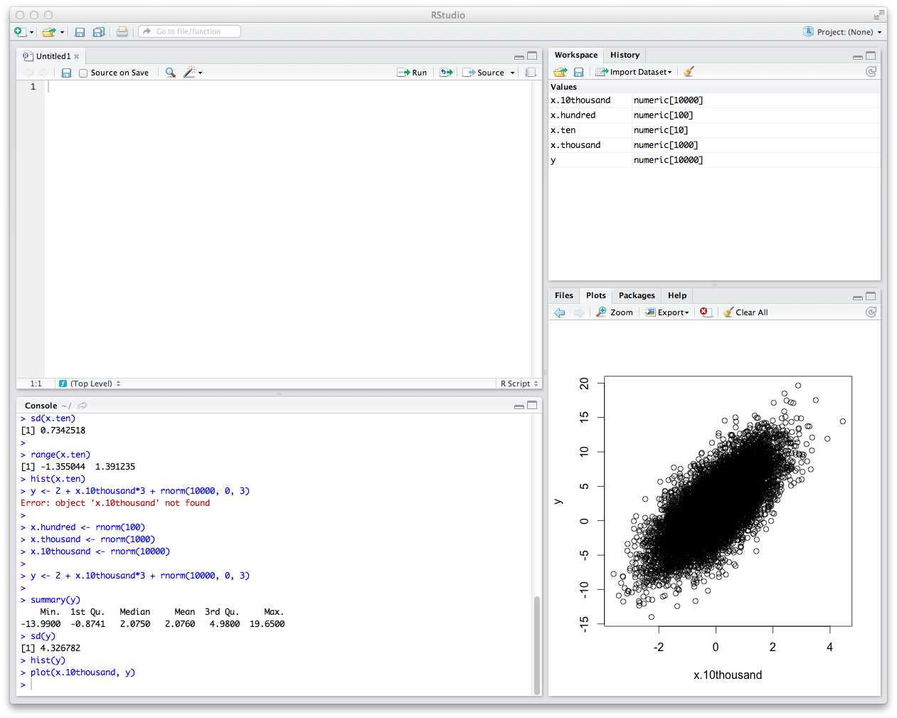
By eyeballing this, this looks like these variables are roughly linearly related. We can draw a regression line (often called a "trend line") through them as an attempt to build a linear model that describes the relationship between the variables.
First, we'll generate a linear model with lm and store it. The argument that lm takes is a little weird: it is in the form dependent variable ~ independent variable.
model <- lm(y ~ x.10thousand)
We can then give the model as an argument to the abline function. We'll also add the col variable so we can see the line more clearly.
abline(model, col = "red")
What we get is a scatterplot with a regression line through it.

If this isn't the line which you would have drawn, don't worry. This is probably because of what are called "outliers" -- values which are extremes and which skew models in different directions. This is one of the perils of model fitting, but this is a topic for another course.
Now let's move on to the American Community Survey data. As I mentioned on Tuesday, the American Community Survey is a sample drawn from the US Census. The 2005 data that we're working with has about 3 million people in it, which is a pretty big dataset. So we're just going to focus on the Wisconsin group in this sample, which is smaller and has about 56,000 people.
First we need to load the data. You're going to install two "packages" (bundles of functions and data) we need for the lab to continue with this command.
install.packages(c("RCurl", "car"))
Then we need to load these packages into your Console.
library(RCurl)
library(car)
Lastly, we need to load the ACS data from the web and load it into RStudio.
bin <- getBinaryURL("http://ssc.wisc.edu/~ahanna/acs-wi.Rdata")
writeBin(bin, "acs-wi.Rdata")
load("acs-wi.Rdata")
Once you do this, you'll notice that your Workspace window will be updated with a row heading called "data" and below it the ACS data in a dataframe called df.wi. You see that it has 56,368 observations and 240 variables. That's a lot of variables. You can think of a dataframe like a spreadsheet. Actually, if you click on df.wi, that's exactly what you'll get in the next window.

You can scroll across and find all kinds of variables that the ACS has collected. Most of these won't be obvious; for this reason we have to rely on the ACS codebook, which you can access with this link: ssc.wisc.edu/~ahanna/ACS2005-Codebook.pdf. Starting on page 1 (page 5 of the PDF), you'll get a rundown of each variable -- its name, description, type, and summary statistics.
Let's work on a variable we saw in lecture on Tuesday, age. The way we access age in a dataframe is to use the $ with the variable name, like so df.wi$AGE. If you type this alone you'll get a big block of numbers. You can check out the first few values by using the head function (note that variable names are case-sensitive -- df.wi$AGE is not the same as df.wi$age).
head(df.wi$AGE)
Next, we're going to cheat a little and use the summary function to see the summary statistics we wanted before. However, we still have to use the sd function to get the standard deviation.
summary(df.wi$AGE)
sd(df.wi$AGE)
Compare your output with your partner. Since you're using the same data, you should be getting the same results.
Now, generate the histogram.
hist(df.wi$AGE)
Does this look like the histogram you saw in lecture?
Let's plot the mean and standard deviation.
abline(v = mean(df.wi$AGE), col = "red")
abline(v = mean(df.wi$AGE)-sd(df.wi$AGE), col = "green")
abline(v = mean(df.wi$AGE)+sd(df.wi$AGE), col = "green")
Like we discussed in lecture, one of the enduring questions in the social sciences is the connection between education and income. Let's explore the connection between these two. You have all the tools to generate summary statistics and the bivariate analysis.
First, generate the summary statistics and histogram for years in school (SCHLN) and annual personal income (PINCP). Compare your results with your partner.
Next, generate the scatter plot of years in school by annual personal income. Remember that years in school is the independent variable and annual personal income is the dependent variable. Lastly, generate a linear model and plot it on top of the scatter plot. This graph should be familiar, since it's the one I showed in lecture.